Color is one of the most powerful tools in a designer’s arsenal. In UI design, the strategic use of color can significantly impact the user experience, guiding attention, creating visual harmony, and evoking emotional responses. One effective method for achieving a balanced and aesthetically pleasing color scheme is the 60-30-10 rule. This classic design principle simplifies the process of color selection, ensuring that your UI is both visually appealing and functional. By understanding and applying this rule, designers can create interfaces that are not only beautiful but also intuitive and user-friendly.
Understanding the 60-30-10 Rule in UI Design
What is the 60-30-10 Rule?
The 60-30-10 rule is a timeless design principle that originated in interior design but has since been adopted across various creative disciplines, including UI design. The rule suggests that three colors should be used in a specific proportion: 60% as the dominant color, 30% as the secondary color, and 10% as the accent color. This formula creates a balanced color palette, allowing for visual interest without overwhelming the user. In the context of UI design, this rule can help in creating interfaces that are both visually cohesive and easy to navigate.
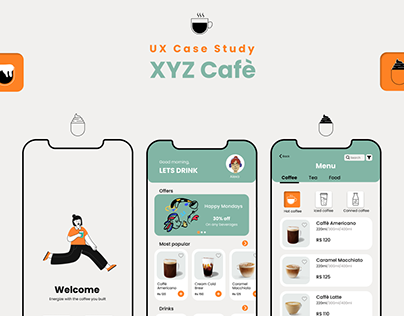
Design by a Kaarwan student_©Nilima Tiwari
Applying the 60-30-10 Rule in Figma Design UI
When working in Figma, one of the most popular tools for UI/UX designers, applying the 60-30-10 rule can be straightforward. Start by selecting your dominant color, which will cover most of the UI elements, such as the background or large sections. The secondary color is used to complement the dominant color, covering areas like sidebars, menus, or subheadings. Finally, the accent color is used sparingly to highlight important elements like buttons, links, or calls to action. This approach ensures that your Figma design UI is balanced, guiding the user’s eye to the most important parts of the interface.
Choosing the Right Color Combination for UI Design
The Psychology of Color in UI Design
Before selecting your 60-30-10 colors, it’s important to consider the psychological impact of color in UI design. Different colors evoke different emotions and reactions. For example, blue is often associated with trust and calm, making it a popular choice for financial and healthcare apps. Red can create a sense of urgency or excitement, making it ideal for calls to action or notifications. Understanding the psychological effects of color can help you choose a color combination that enhances the user experience and aligns with the brand's message.
Tips for Selecting Your 60-30-10 Colors
Dominant Color (60%): Choose a neutral or calming color that forms the background or major components of the UI. This color should not overpower the design but serve as a foundation.
Secondary Color (30%): Select a color that complements the dominant color and adds depth to the design. This color will highlight secondary features like navigation bars or side panels.
Accent Color (10%): Pick a vibrant, contrasting color that stands out against the dominant and secondary colors. This color is used to draw attention to important elements like buttons or alerts.
Using these guidelines, you can create a harmonious color palette that adheres to the 60-30-10 rule, ensuring that your UI design is both aesthetically pleasing and functional.
Design by a Kaarwan student_©Nilima Tiwari
The Role of the 60-30-10 Rule in UI/UX Design Certification Courses
Why Mastering Color Theory is Essential for UI/UX Designers
In UI/UX design courses, such as a UI UX design course or UX design certification, color theory and the 60-30-10 rule are often fundamental topics. Understanding how to effectively use color in design is crucial for creating user interfaces that are not only visually appealing but also user-centric. These courses typically cover the psychological impact of color, how to create color harmony, and how to apply the 60-30-10 rule in various design projects. Mastering these concepts can set you apart as a designer, enabling you to create more effective and engaging user experiences.
Learning to Apply the 60-30-10 Rule in Professional Projects
In professional settings, the ability to apply the 60-30-10 rule can streamline the design process and improve collaboration with clients and stakeholders. By presenting a well-structured color scheme based on this rule, you can clearly communicate your design choices and how they enhance the overall user experience. Whether you’re working on a web app, mobile interface, or other digital platforms, the 60-30-10 rule provides a reliable framework for creating cohesive and effective designs.
Practical Examples of the 60-30-10 Rule in UI Design
Case Study: Implementing the 60-30-10 Rule in a Mobile App
Consider a mobile app designed for a fitness brand. The dominant color (60%) might be a calming shade of blue, representing trust and professionalism. The secondary color (30%) could be a vibrant green, symbolizing health and energy, used for secondary elements like navigation and side menus. The accent color (10%), perhaps a bold red or orange, could be reserved for calls to action, such as “Sign Up” or “Start Workout” buttons. This application of the 60-30-10 rule creates a visually balanced interface that guides the user’s attention while reinforcing the brand’s identity.
Visual Harmony and User Experience
The 60-30-10 rule not only contributes to the visual harmony of a design but also enhances the overall user experience. By carefully selecting and balancing colors, designers can create intuitive and aesthetically pleasing interfaces that are easy to navigate. This balance is particularly important in UI design, where the visual appeal must align with functionality to provide a seamless user experience.
Design by a Kaarwan student_©Nilima Tiwari
Conclusion: Mastering the 60-30-10 Rule for Effective UI Design
The 60-30-10 rule is a powerful tool for creating balanced and visually engaging UI designs. By understanding how to choose and apply colors according to this rule, designers can enhance the aesthetics and usability of their projects. Whether you’re working in Figma or another design tool, the principles of the 60-30-10 rule remain relevant, helping you create interfaces that are both beautiful and functional.
For aspiring UI/UX designers, mastering this rule is an essential step in developing a strong design portfolio. By incorporating the 60-30-10 rule into your design process, you can ensure that your work stands out in the competitive field of UI/UX design. As you continue to refine your skills through a UI UX design course or UX design certification, the 60-30-10 rule will become a valuable asset in your toolkit, enabling you to create cohesive and engaging user interfaces that resonate with users.
Are you ready to make a lasting impact? Dive into UI UX design and unlock a world of creative potential. Consider enrolling in Kaarwan's UI UX Design Certification Course to gain the tools and knowledge you need to flourish in this high-growth career.
Visit theKaarwan website for more insights! 📈

