In the age of information overload, where data reigns supreme, the ability to communicate complex information clearly and concisely is more crucial than ever. This is where data visualization steps in as a game-changer for UI-UX design.
What is Data Visualization?
Data visualization is the art of transforming raw data into graphical elements like charts, graphs, and infographics. It's about bringing data to life, making it easier for users to understand patterns, trends, and insights that might be hidden within spreadsheets and tables.
Imagine a user bombarded with pages of numbers and statistics. Confusing, right? Now imagine the same data presented in a visually appealing bar chart, highlighting key trends. Suddenly, the information becomes clear and actionable. That's the power of data visualization.
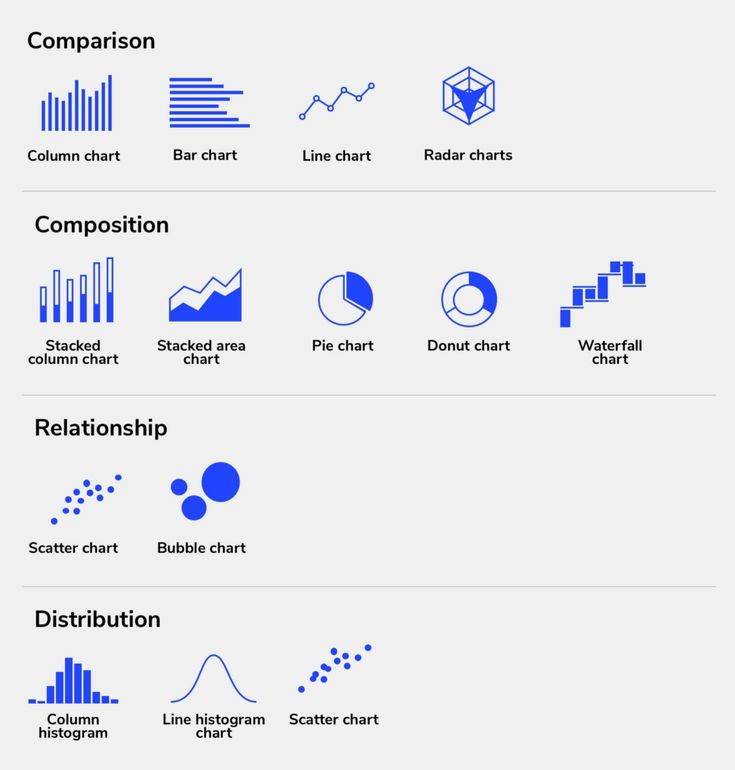
Data charts used for different information presentation_©uxplanet.org
Why is Data Visualization Important in UI-UX Design?
Data visualization plays a critical role in UI-UX design by:
Enhancing User Experience (UX): Complex data can be daunting to navigate. Data visualization simplifies information consumption, allowing users to grasp the essence quickly through charts and graphs. This translates to a more engaging and user-friendly experience.
Improving Decision-Making: Visual representations of data empower users to make informed choices. By presenting clear and concise information, data visualization helps users analyze data faster, leading to more effective and efficient decision-making processes.
Here's a breakdown of the benefits of data visualization in UI-UX design:
Increased User Engagement: Interactive visualizations allow users to explore data in depth, fostering a more active and engaging experience.
Improved Clarity and Understanding: Visual elements make complex data more digestible, leading to better comprehension and knowledge retention.
Enhanced Communication: Data visualizations act as a universal language, effectively communicating insights across different user groups.
Data-Driven Design Decisions: By basing design choices on data insights, designers can create interfaces that are more relevant and functional for users.
Key Principles of Effective Data Visualization
Just like any powerful tool, data visualization needs to be wielded effectively. Here are some core principles to follow:
Clarity and Simplicity: Keep it clear and concise. Avoid overloading visualizations with unnecessary elements. Focus on delivering the core message in a straightforward manner.
Visual Hierarchy: Guide users through the data by emphasizing the most critical information. Use visual cues like size, color, and placement to prioritize key insights.
Matching Visualization to Data Type: Different data types call for different visualization techniques. Choose the right chart (bar chart, line graph, pie chart, etc.) to best represent the data and the story you want to tell.
Here are some additional tips to keep in mind:
Maintain consistency: Use a uniform color scheme, font style, and layout across all visualizations for a cohesive user experience.
Accessibility: Ensure your visualizations are accessible to users with visual impairments by using proper color contrast and providing alternative text descriptions.
Focus on the user: Tailor visualizations to your target audience's needs and preferences. Consider their level of data literacy and what information would be most valuable to them.
Unleashing the Power: Tools for Data Visualization
The good news is that you don't need a team of data scientists to create effective data visualizations. Several free and paid tools cater to UI-UX designers:
Free Data Visualization Tools: These tools offer robust features without breaking the bank. Popular options include Google Data Studio, Tableau Public, and infogram.
Paid Data Visualization Tools: While free tools offer a solid foundation, paid tools like Tableau Desktop and QlikView provide advanced functionalities like real-time data updates and extensive customization options.
Choosing the right tool depends on your specific needs and budget. Free tools are ideal for beginners or projects with simpler data sets. Paid tools cater to more complex data analysis and visualization requirements.
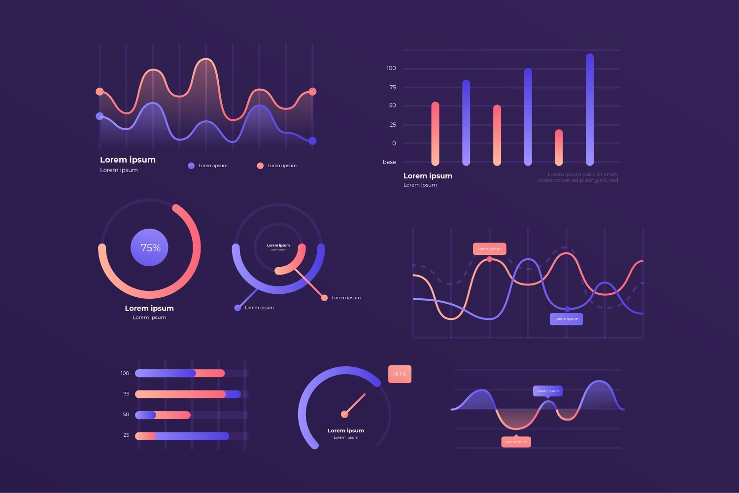
Data charts used for different information presentation_©freepik
Data Visualization Techniques
Data visualization is a powerful tool, but it's only effective if you pick the right chart to represent your data. Different chart types excel at showcasing various data points and relationships. Here's a closer look at some popular data visualization techniques and when to use them:
1. Bar Charts: Ideal for Comparisons
Bar charts are horizontal or vertical bars that represent different categories of data. The length or height of the bar corresponds to the value of the data point. Bar charts are ideal for comparing data across different categories, making them perfect for showcasing things like:
Sales figures across different product categories
Customer satisfaction ratings for various service options
Website traffic by source (organic, social media, etc.)
They are easy to read and understand, making them a great choice for general audiences.
2. Line Graphs: Tracking Trends Over Time
Line graphs use lines to connect data points plotted along a horizontal (time) and vertical (value) axis. They are excellent for visualizing trends and patterns over time. For instance, line graphs can be used to show:
Stock prices over a specific period
Website traffic growth over months
Temperature fluctuations throughout the day
Line graphs help users identify changes and relationships between data points at different time intervals.
3. Pie Charts: Showcasing Proportions of a Whole
Pie charts are circular charts divided into slices, where each slice represents a category, and its size corresponds to its proportion of the whole. Pie charts are effective for displaying how parts relate to a whole, making them suitable for:
Budget breakdowns (allocation of funds across different expense categories)
Market share distribution among competitors
Survey results showing respondent preferences (e.g., favorite color)
However, pie charts can become cluttered if there are too many slices. It's generally recommended to limit pie charts to a maximum of five to seven categories.
4. Scatter Plots: Unveiling Relationships Between Variables
Scatter plots use dots to represent data points on a graph with horizontal and vertical axes. Each dot represents a single data point, and the position of the dot reflects the values for two variables. Scatter plots are useful for:
Identifying correlations or relationships between two variables (e.g., study hours vs. exam scores)
Highlighting outliers or data points that deviate significantly from the norm
Visualizing the distribution of data points
Scatter plots can reveal hidden patterns and connections that might not be evident in other chart types.
These are just a few examples of common data visualization techniques. By understanding the strengths and weaknesses of each chart type, UI-UX designers can choose the most appropriate way to represent their data and effectively communicate insights to users.
Best Practices for Integrating Data Visualization in UI-UX Design
Here's how to seamlessly integrate data visualization into your UI-UX design process:
Data-Driven Design Decisions: Make data the driving force behind your design choices. Analyze user behavior and data trends to inform your design decisions, resulting in more effective and user-centric interfaces.
User-Centered Design Approach: Put the user at the forefront of the design process. Use data visualization to understand user needs and tailor the interface accordingly. This ensures a more personalized and efficient user experience.
Test and Iterate: As with any design element, test your data visualizations with real users. Gather feedback and iterate on your designs to ensure they are clear, informative, and engaging for your target audience.
Conclusion
By effectively leveraging data visualization, UI-UX designers can transform overwhelming data into clear and engaging experiences. Understanding core principles, choosing the right chart type for the data, and prioritizing user needs are all essential for creating impactful data visualizations. As data continues to be a driving force, mastering this skill will set UI-UX designers apart, allowing them to craft interfaces that are both informative and user-friendly.
Want to transform data into user-friendly experiences? Our UI-UX Design Certification Course teaches powerful data visualization techniques. Enroll today & level up your design skills!
Visit the Kaarwan website for more insights!
FAQs
Q1. What is data visualization in UI-UX design?
A1. Data visualization in UI-UX design is the process of transforming raw data into visual formats like charts, graphs, or infographics. It simplifies complex information, making patterns and trends more accessible and engaging for users.
Q2. Why is data visualization important for user experience?
A2. Data visualization improves user experience by simplifying complex information, enhancing clarity, and fostering engagement. It helps users understand data quickly, leading to more informed and efficient decision-making.
Q3. What are the key principles of effective data visualization?
A3. Key principles include clarity and simplicity, using visual hierarchy, matching the chart type to the data, maintaining consistency in design, ensuring accessibility, and tailoring visualizations to the audience's needs.
Q4. Which tools are recommended for creating data visualizations in UI-UX design?
A4. Popular tools include Google Data Studio and Tableau Public for free options, while Tableau Desktop and QlikView provide advanced features for paid solutions. Choose based on project complexity and budget.
Q5. How do different chart types serve various purposes in data visualization?
A5. Bar charts compare categories, line graphs track trends over time, pie charts show proportions, and scatter plots reveal relationships between variables. Each serves unique needs for effective data communication.