Visual design forms the core of a well-crafted user interface (UI). It’s what users see first and what influences their interaction with the digital space. The application of visual design principles ensures that UI elements are aesthetically pleasing, functional and user-friendly. Designers who master these principles can create interfaces that deliver seamless user experiences, leaving a lasting impression on users.
The Importance of Visual Design in UI/UX
How people see and use digital products is greatly influenced by their visual appearance. A well-designed UI guides users through an interface effortlessly, improving their experience and satisfaction. This underscores the significance of visual design in the broader context of UI/UX, where every element must serve a purpose and enhance the overall user experience.
Understanding Visual Hierarchy in UI Design
Visual hierarchy is about arranging design elements so that the most important ones stand out. By thoughtfully using size, color, and positioning, designers can direct users’ attention to key parts of the interface.
For example, larger or bolder text can highlight primary actions, while muted tones can push less critical information to the background. Establishing a clear visual hierarchy is essential for helping users navigate the interface efficiently.
Key Techniques for Establishing Visual Hierarchy
Size and Scale: Larger elements attract more attention, so use size to emphasize important features.
Color and Contrast: Bright colors can draw the eye, while contrast helps differentiate elements.
Placement: Positioning key elements where users expect them, like top-left corners, enhances usability.
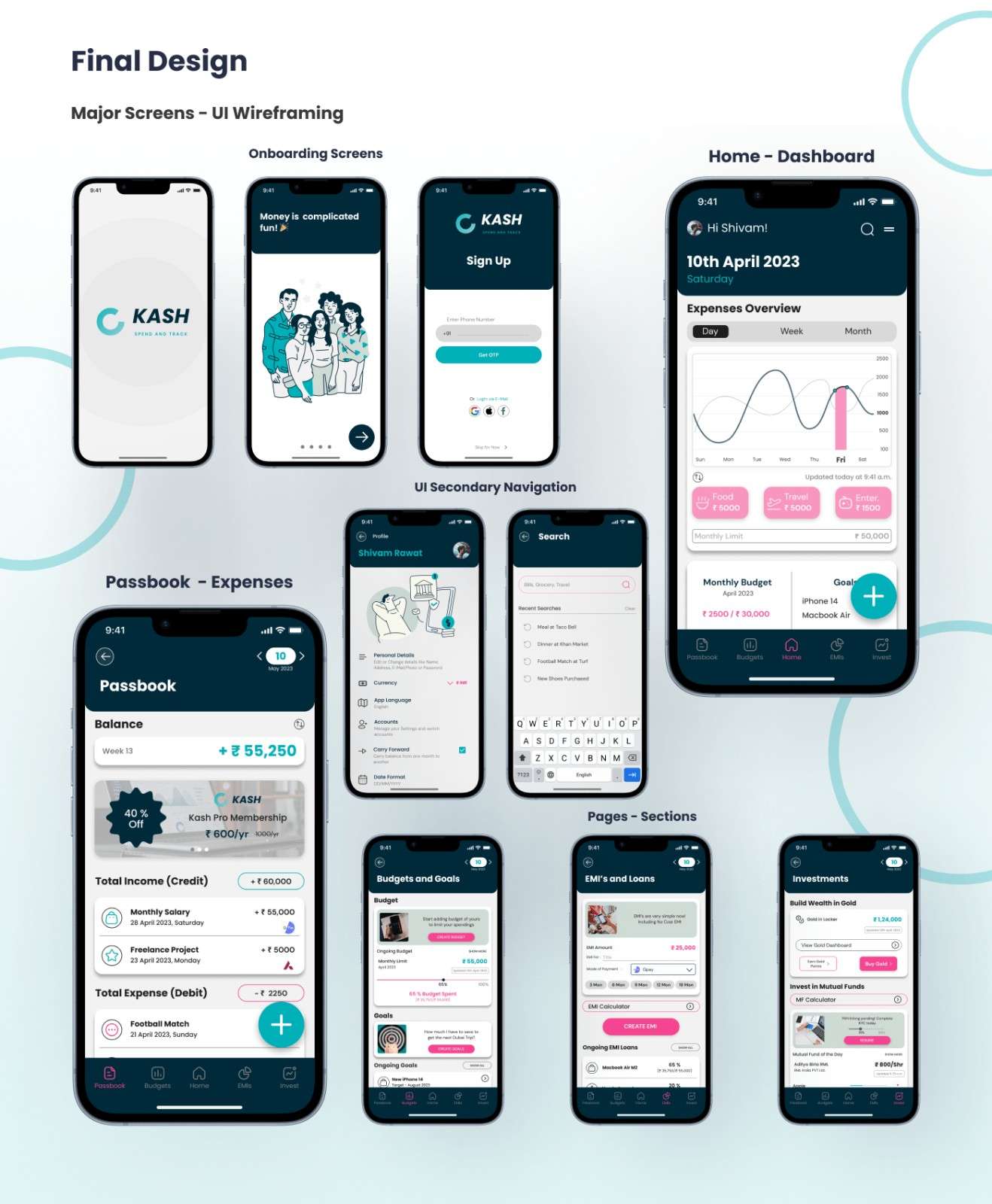
KASH- Finance App by Kaarwan student_©Shivam Rawat on Behance.net
The Role of Color Theory in UI Design
Color is a powerful tool in UI design. It can evoke emotions, influence behaviors, and reinforce branding. Understanding color theory helps designers choose color palettes that resonate with users and enhance the interface's visual appeal. When applied correctly, color can guide users, highlight critical actions, and create a cohesive and engaging user experience.
Practical Applications of Color in UI
Brand Consistency: Use brand colors to strengthen identity and build trust.
Emotional Impact: Warm colors can evoke excitement, while cool colors often create a calming effect.
Accessibility: Ensure sufficient contrast for readability, especially for users with visual impairments.
The Influence of Typography on UI
Typography is a vital aspect of visual design. The choice of font, size, and spacing affects not only readability but also the overall tone of the interface. Well-considered typography can enhance the user experience by making content accessible and engaging. On the other hand, poor typography choices can lead to confusion and frustration, detracting from the interface's usability.
Best Practices in Typography for UI
Readability: Select fonts that are clear and easy to see on various devices.
Hierarchy: Use different font sizes and weights to create a clear content structure.
Consistency: Maintain uniformity in font usage to create a cohesive experience.
Balance and Alignment: The Foundation of Professional UI
Balance and alignment are essential for creating a visually pleasing and professional UI. Balance ensures that no part of the design feels too heavy or out of place, while alignment organizes elements neatly, making the interface easier to navigate. Together, these principles help create a polished look that enhances user satisfaction and trust.
How to Achieve Balance and Alignment
Symmetrical Balance: Mirror elements on either side of the axis for a harmonious design.
Asymmetrical Balance: Use different elements to create a balanced composition without mirroring.
Alignment: Align elements to a grid or baseline to ensure visual order and coherence.
Utilizing White Space in UI Design
White space, or negative space, is the empty area around UI elements. It might seem like wasted space, but it’s crucial for creating an uncluttered and easy-to-navigate interface. By giving elements room to breathe, white space enhances readability and helps users focus on key content, making the overall design more effective.
Benefits of White Space in UI
Improves Focus: White space draws attention to important elements.
Enhances Readability: Adequate spacing between text and UI components makes content easier to read.
Creates a Modern Look: Minimalist designs with ample white space often feel more contemporary and professional.
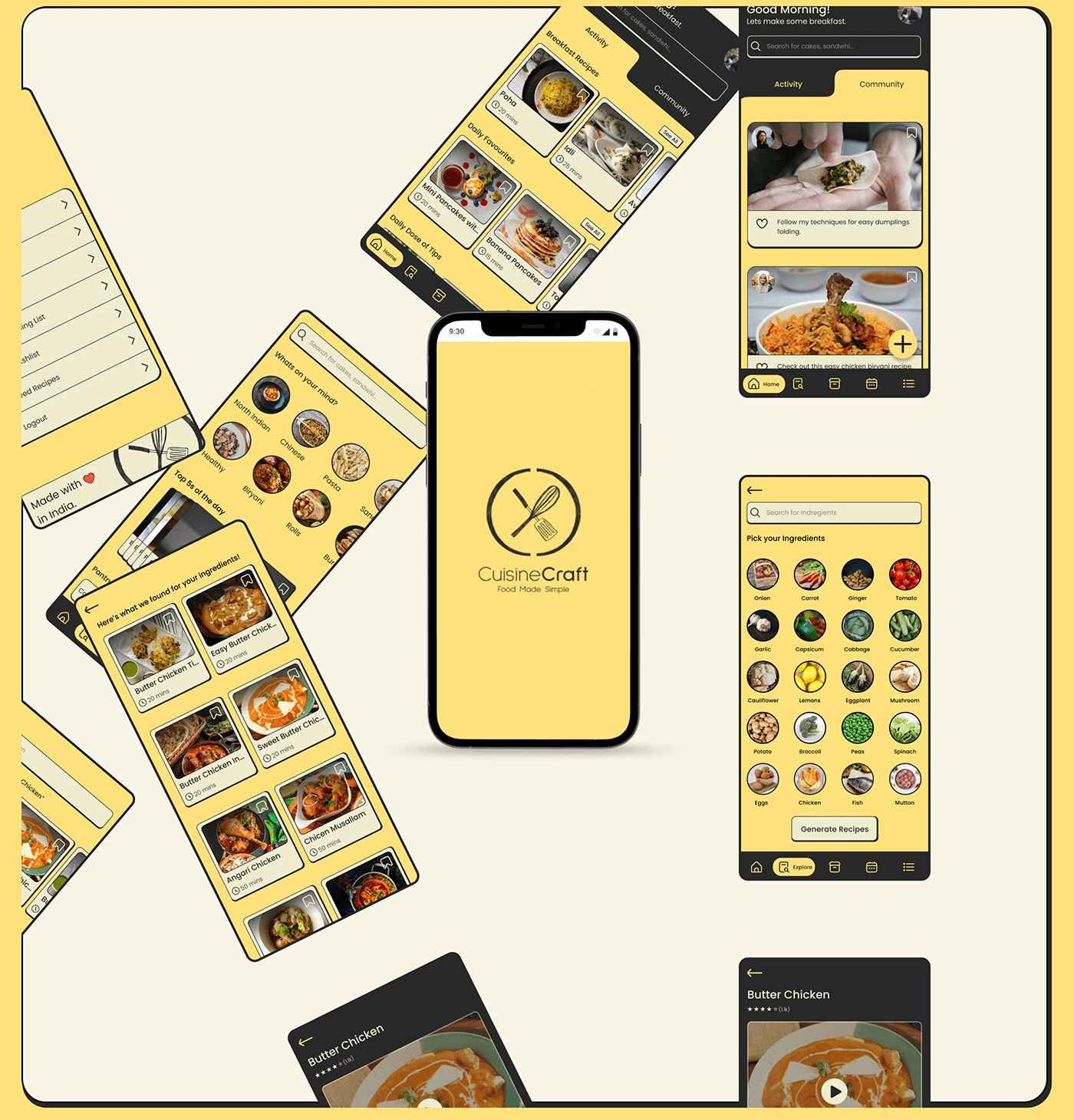
CuisineCraft - A Recipe App by Kaarwan student_©Priyam Yadav on Behance.net
Ensuring Consistency in UI Design
Consistency in design is vital for creating a user-friendly interface. When UI elements behave and appear predictably, users can navigate the interface with confidence, leading to a smoother experience. Consistent use of colors, fonts, and spacing helps build a cohesive design that users can easily understand and trust.
Strategies for Maintaining Consistency
Design Systems: Develop a design system or style guide to ensure uniformity across the interface.
Repeatable Patterns: Use consistent layouts and components throughout the design.
User Feedback: Regularly test the interface with users to ensure consistent usability.
The Impact of Contrast and Emphasis on UI
Contrast is a powerful design tool that can highlight important elements and make them stand out. By varying color, size, or shape, designers can create emphasis, guiding users’ attention to specific parts of the interface. Proper use of contrast not only improves usability but also makes the design more dynamic and engaging.
Implementing Effective Contrast in UI
Color Contrast: Use contrasting colors to differentiate buttons, links, and other interactive elements.
Text Emphasis: Bold or enlarge critical text to draw attention.
Shape and Size Variations: Use distinct shapes or sizes to highlight key actions or content.
Organizing UI with Proximity and Grouping
Proximity refers to the spatial relationship between UI elements. Grouping related items together makes the interface more intuitive, as users naturally associate closer items as being related. This principle helps create a more organized and user-friendly design, where information is easy to find and process.
Practical Grouping Techniques in UI
Logical Grouping: Place related elements close together, such as form fields or navigation links.
Visual Cues: Use borders, backgrounds, or whitespace to create distinct groups.
User Expectations: Arrange elements in a way that meets user expectations for ease of use.
Structuring UI with Grid Systems
Grid systems are a fundamental part of UI design, providing a framework for organizing content in a structured way. By aligning elements to a grid, designers can ensure consistency and clarity across the interface. Grids also help create responsive designs that look good on different screen sizes, enhancing the overall user experience.
Advantages of Using Grid Systems
Uniform Layouts: Grids ensure that elements are consistently placed and sized.
Responsive Design: Grids help in creating interfaces that adapt well to different screen sizes.
Visual Harmony: Grid systems create a balanced and aesthetically pleasing design.
Designing Intuitive Navigation through Visual Cues
User navigation is essential to a good user interface, and visual design can greatly improve its ease of use. By using visual cues like icons, color, and positioning, designers can create navigation systems that users find easy to understand and use. Intuitive navigation leads to a smoother user experience, reducing frustration and improving engagement.
Enhancing Navigation with Visual Design
Consistent Icons: Use recognizable icons to represent common actions, like search or settings.
Color Coding: Apply color to indicate active links or current locations.
Clear Hierarchy: Organize navigation elements in a logical and easy-to-follow structure.
The Influence of Visual Design on User Engagement
Visual design significantly impacts how users interact with and feel about a product. A well-crafted interface draws people in and keeps them interested, making it easy and enjoyable to use. By applying visual design principles effectively, designers can create interfaces that are not only beautiful but also functional, leading to higher user satisfaction.
Strategies to Boost User Engagement through Design
Interactive Elements: Use interactive elements like hover effects or animations to engage users.
Clear Call-to-Actions (CTAs): Design prominent and enticing CTAs to encourage user interaction.
User-Centered Design: Focus on the user’s needs and preferences to create a more personalized experience.
Applying Gestalt Principles in UI Design
Gestalt principles explain how people perceive visual elements as a whole rather than as separate parts. These principles are invaluable in UI design, helping create interfaces that are cohesive and easy to navigate. By understanding how users naturally group elements, designers can craft more intuitive and user-friendly designs.
Key Gestalt Principles for UI
Similarity: Objects with matching shapes, colors, or sizes are often seen as belonging together.
Proximity: Elements that are close together are seen as a group.
Continuity: Users tend to follow the smoothest path, so align elements along a clear, continuous line.
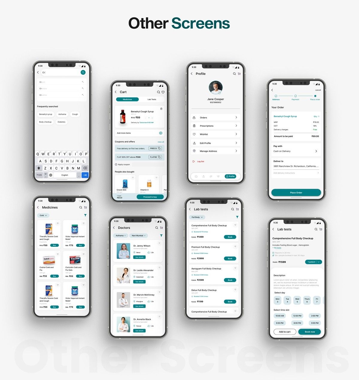
Pharmacy App by Kaarwan student_©Aditya Patil on Behance.net
Designing for Accessibility in UI
Accessibility is an essential consideration in UI design, ensuring that digital products are usable by everyone, regardless of their abilities. Inclusive design means creating UI elements that are accessible to users with visual, auditory, or motor impairments. This includes providing alternative text for images, ensuring sufficient color contrast, and designing interfaces that are navigable via keyboard.
Best Practices for Accessibility in UI Design
High Contrast: Make the text easy to read by using colors that are clearly different from the background.
Text Alternatives: Provide text alternatives for non-text content like images or videos.
Keyboard Navigation: Verify that keyboard controls are available for all clickable elements.
The Relationship Between Visual Design and Brand Identity
Visual design is a powerful tool for communicating brand identity. Through the consistent use of color, typography, and imagery, designers can create interfaces that reflect the brand’s personality and values. A strong visual identity makes the interface more memorable and helps build trust and loyalty with users.
Strengthening Brand Identity through Design
Consistent Use of Brand Colors: Stick to the brand’s color palette to reinforce identity.
Typography Choice: Use fonts that align with the brand’s voice and tone.
Imagery and Iconography: Select images and icons that resonate with the brand’s values and message.
Conclusion: Your Path to Mastery in Visual Design
Mastering visual design principles is essential for creating polished and professional UI elements. By grasping and applying fundamental design principles, you can create interfaces that look great and are easy to use. To become a skilled UI designer, you need to keep learning, practicing, and paying close attention to detail. With dedication and the right tools, you can design interfaces that stand out in the competitive world of digital design.
Stand out in UI/UX with Visual Design Power! Build stunning interfaces and craft exceptional user experiences. Join our UI-UX Design Certification Course today and learn from industry experts!
Visit the Kaarwan website for more insights!
FAQs
Q1: What is the role of visual design in UI/UX?
A1: Visual design in UI/UX is important as it determines how users perceive and interact with digital products. It enhances user experience by making interfaces aesthetically pleasing, functional, and user-friendly, guiding users effortlessly through the interface.
Q2: How does visual hierarchy impact UI design?
A2: Visual hierarchy arranges UI elements by their importance, using size, color, and positioning. This helps direct users' attention to key features, making the interface more intuitive and easier to navigate.
Q3: Why is color theory important in UI design?
A3: Color theory is vital in UI design because it influences user emotions, behaviors, and brand perception. Correct color application can guide users, highlight essential actions, and create a cohesive and engaging experience.
Q4: What are the best practices for typography in UI design?
A4: Best practices for typography in UI design include ensuring readability, establishing a clear content hierarchy with different font sizes and weights, and maintaining consistency across the interface for a cohesive user experience.
Q5: How does white space contribute to UI design?
A5: White space, or negative space, is essential in UI design as it enhances readability, improves focus on important elements, and creates a clean, modern look by preventing clutter on the interface.

